I've taken two photographs this week on my ramblings while shopping which have both elements I hadn't noticed at the time, but which I think add to the pictures.
The first is a 'street' photograph in the Flickr style. Just some casual snap of someone at a market.. The subject was the man looking at the stereoscope. I hadn't noticed the woman in the background inspecting some object I can't identify. But two people appraising two objects in the same picture makes it work a little better. Then there's the rubber mallet in the man's left hand, which also went unseen at the time. What would he want with a mallet and a stereoscope? That the man's gaze leads your eye to the woman, and her gaze sort of leads you to the mallet is pure coincidence. But that's one of the fascinations of photography.
The second picture is different in style and was taken with my parking project in mind. Although I've still not found the key to make that project work. I wanted the penalty charge notice and the ticket in the shot. I didn't notice the reflection of the parking sign until I was processing the frame. It needed a bit of work to make it more obvious but now it brings together three elements of the on-street parking 'experience' in one frame.
I need to sit down with the pictures I've made about it so far and think about why parking interests me as a subject, then see if there's a way to express that visually without being too literal. Trouble is doing that is likely to make my head hurt.
Wednesday, 25 February 2015
Monday, 23 February 2015
More books
It doesn't seem like three months since I wrote about Black Country Stories. Although both Martin Parr and Chris Steele-Perkins are members of Magnum their pictures are very different in style.
A Place in the Country could easily have been a coffee table book look at the life of an English country house. I came across one such book on one of my web surfing trips and despite the pictures being 'nice' the thing seemed to more like a travel brochure. Chris Steele-Perkins avoids this approach, as is to be expected.
The two bodies of work overlap in time, with pictures of Jubillee celebrations appearing in both volumes. While the two books deal with different aspects of British life, and the style of the pictures are different, the feel of them somehow gets across, to me at least, something about Englishness that binds social strata together. I think they make good companions on my bookshelf.
They say that if you are a collector you should focus on one theme and on items you like rather than on ones you think might increase in value. This is why I have missed out on a couple of books which sold out quickly and escalated in value immediately - even though I knew they would. I don't have much of a head for business...
Sticking with my British theme I recently added a book that's been on my wish list for some time. Jem Southam's The River, Winter. What eventually made be buy the book was watching a lecture he gave in association with On Landscape. I'd read an interview with Southam in a free to view edition some time back, so when the video was available to watch for just a couple of quid I coughed up. It was well worth the money. I really enjoyed listening to him talking about his approach, and the pictures were interesting too. There's a free to watch interview with Jem Southam here, and the full lecture can be found on that site once you have registered.
While not documentary in the same sense as Black Country Stories or A Place in the Country, there is a documentary aspect to the Southam book, but it is essentially a quiet, contemplative work that is almost the opposite of what hobbyist photographers think of as landscape photography. There are no punchy sunsets or wide angle lenses in evidence!
There was a very high tide last week and I took the opportunity to go look at the marsh at the tide's peak. Quite a remarkable sight to see so much water right up to the floodbank. I think I made one frame that sort of sets the scene for the place better than my previous attempts in the same spot with the tide out. I'm not convinced I'll ever be cut out for landscape photography though.
A Place in the Country could easily have been a coffee table book look at the life of an English country house. I came across one such book on one of my web surfing trips and despite the pictures being 'nice' the thing seemed to more like a travel brochure. Chris Steele-Perkins avoids this approach, as is to be expected.
The two bodies of work overlap in time, with pictures of Jubillee celebrations appearing in both volumes. While the two books deal with different aspects of British life, and the style of the pictures are different, the feel of them somehow gets across, to me at least, something about Englishness that binds social strata together. I think they make good companions on my bookshelf.
They say that if you are a collector you should focus on one theme and on items you like rather than on ones you think might increase in value. This is why I have missed out on a couple of books which sold out quickly and escalated in value immediately - even though I knew they would. I don't have much of a head for business...Sticking with my British theme I recently added a book that's been on my wish list for some time. Jem Southam's The River, Winter. What eventually made be buy the book was watching a lecture he gave in association with On Landscape. I'd read an interview with Southam in a free to view edition some time back, so when the video was available to watch for just a couple of quid I coughed up. It was well worth the money. I really enjoyed listening to him talking about his approach, and the pictures were interesting too. There's a free to watch interview with Jem Southam here, and the full lecture can be found on that site once you have registered.
While not documentary in the same sense as Black Country Stories or A Place in the Country, there is a documentary aspect to the Southam book, but it is essentially a quiet, contemplative work that is almost the opposite of what hobbyist photographers think of as landscape photography. There are no punchy sunsets or wide angle lenses in evidence!
There was a very high tide last week and I took the opportunity to go look at the marsh at the tide's peak. Quite a remarkable sight to see so much water right up to the floodbank. I think I made one frame that sort of sets the scene for the place better than my previous attempts in the same spot with the tide out. I'm not convinced I'll ever be cut out for landscape photography though.
Labels:
books,
Chris Steele-Perkins,
documentary,
Jem Southam,
landscape,
magnum
Sunday, 22 February 2015
Slow on the uptake
When I've been to the poultry shows I'd been plagued by variations in white balance. I'd put this down to a combination of light sources in the shed. Yesterday there was another show and early one I noticed some pictures which had two colour casts as bands over the frame (see right). It wasn't until I was sat having a mug of tea that I remembered reading on 'that forum' about the cycling of fluorescent tubes causing such issues. Why hadn't I made the association earlier? D'oh!
Shooting in low light without flash my usual procedure is to set the shutter speed and aperture manually, letting the camera set the ISO. As a rule I use 1/125th of a second as my starting point and vary the aperture as I go along. Occasionally I'll nudge the shutter speed around. For chickens faster is better as they are twitchy creatures.
Unable to recall the shutter speed I needed to select I scrolled through the pics on the back of the camera looking to see which speeds were causing the problem. Anything at1/125th was affected to varying degrees, anything at 1/00th or lower was fine. Reset the shutter speed and back in the shed. Problem solved.
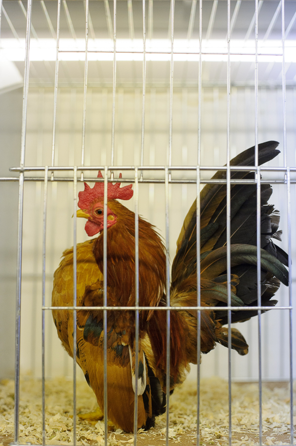
There's a saying that dogs and owners grow to look like each other. I'm not sure if it's the same with chickens, but both the owners and the fowl have character. I wouldn't want to argue with this cockerel!
It's a funny thing, but when you revisit places or events two contradictory effects are at play with finding pictures. After a while familiarity kicks in and you start to repeat pictures. Not altogether a bad thing as you are constantly looking for better and better versions of the same picture. On the other had the more times you go to an event the greater the chances of something unusual happening. This came together for me with the frame below that combined a bantam with it's head out of the cage (seen before) with a background bird and a unifying yellow theme (birds and rosette) in a reasonably gestural composition.
I tried to make more people pictures than in previous visits. It's a difficult venue because the aisles are narrow and most of the time people are looking at cages. I also managed to bugger up the two potentially best people pics by missing focus through incompetence. This being one. Oh well.
I did 'nail focus' on one I liked. The chicken on the apron is a neat little detail.
With a bit of luck I'll learn from my mistakes. A pity I always learn long after the event...
Gallery.
Shooting in low light without flash my usual procedure is to set the shutter speed and aperture manually, letting the camera set the ISO. As a rule I use 1/125th of a second as my starting point and vary the aperture as I go along. Occasionally I'll nudge the shutter speed around. For chickens faster is better as they are twitchy creatures.
Unable to recall the shutter speed I needed to select I scrolled through the pics on the back of the camera looking to see which speeds were causing the problem. Anything at1/125th was affected to varying degrees, anything at 1/00th or lower was fine. Reset the shutter speed and back in the shed. Problem solved.
There's a saying that dogs and owners grow to look like each other. I'm not sure if it's the same with chickens, but both the owners and the fowl have character. I wouldn't want to argue with this cockerel!
It's a funny thing, but when you revisit places or events two contradictory effects are at play with finding pictures. After a while familiarity kicks in and you start to repeat pictures. Not altogether a bad thing as you are constantly looking for better and better versions of the same picture. On the other had the more times you go to an event the greater the chances of something unusual happening. This came together for me with the frame below that combined a bantam with it's head out of the cage (seen before) with a background bird and a unifying yellow theme (birds and rosette) in a reasonably gestural composition.
I tried to make more people pictures than in previous visits. It's a difficult venue because the aisles are narrow and most of the time people are looking at cages. I also managed to bugger up the two potentially best people pics by missing focus through incompetence. This being one. Oh well.
I did 'nail focus' on one I liked. The chicken on the apron is a neat little detail.
With a bit of luck I'll learn from my mistakes. A pity I always learn long after the event...
Gallery.
Tuesday, 17 February 2015
Somebody stop me!
I must stop putting the subject smack bang in the middle of the frame and taking symmetrical photos.
Anyway. I managed to get hold of another (used, naturally) copy of the lens I had to return last week. This one does as it should, and produces pics with then same visual qualities. Note; that's not the same as Image Quality, which is something gearheads take to mean 'sharpness'. Apart from it being small and light I really like the way the out of focus regions decay. Some cheapo lenses give harsh, almost jagged, out of focus areas. This one doesn't. It gives good bokeh.
Damn. That post's in the middle of the frame...
How out of focus areas appear is important. Not for the popular reason of using shallow depth of field for its own sake - which is a mannerism - but so that background detail can be 'read' even though it is out of focus. If it all goes to mush you lose context and are left with a subject floating around in space. Degraded detail maintains the context. Without knowing where something is, how it relates to its surroundings there's no 'story' to the picture.
While most camera nerds test lenses for sharpness with charts pinned to walls and their cameras set up precisely parallel to them on rock-solid tripods, I go out and take hand-held pictures of signs. Signs are good because the lettering and images have sharp edges, and they are sometimes printed on surfaces with fine textures. These two, when pixel-peeped, are as sharp as I need.
I quite like them as pictures too. Which is actually why I shot them. They just happened to provide a test of the lens's sharpness. Somehow I managed to make them unsymmetrical too.
Either I've been dead lucky, I'm not fussy, or a lot of internet-photographers are deluded, but I've yet to buy a Nikon lens which has needed to be adjusted to my camera bodies. I've fiddled with the fine tuning feature a couple of times and seen no difference. Maybe if my camera was always locked down on a tripod with the aperture wide open I'd see the need, but as I either shoot hand-held or with the lens stopped down when the camera is (rarely) on a tripod I either have enough depth of focus to hide imperfections, or they are likely to be messed up by my shaky hands anyway. In fact any focussing issues I have I always blame on poor technique rather than faulty or misaligned gear. More people ought to admit to their inadequacies in this department I reckon.
Looked at 100% on the computer this shot is sharp where it needs to be sharp - on the hook. No fine tuning, hand held, available light, and a lens which has a flake of crap inside it. It's the second frame. The first was well soft thanks to my dodgy technique. Nice bokeh, too...
Odd folk, carp anglers.
Anyway. I managed to get hold of another (used, naturally) copy of the lens I had to return last week. This one does as it should, and produces pics with then same visual qualities. Note; that's not the same as Image Quality, which is something gearheads take to mean 'sharpness'. Apart from it being small and light I really like the way the out of focus regions decay. Some cheapo lenses give harsh, almost jagged, out of focus areas. This one doesn't. It gives good bokeh.
Damn. That post's in the middle of the frame...
How out of focus areas appear is important. Not for the popular reason of using shallow depth of field for its own sake - which is a mannerism - but so that background detail can be 'read' even though it is out of focus. If it all goes to mush you lose context and are left with a subject floating around in space. Degraded detail maintains the context. Without knowing where something is, how it relates to its surroundings there's no 'story' to the picture.
While most camera nerds test lenses for sharpness with charts pinned to walls and their cameras set up precisely parallel to them on rock-solid tripods, I go out and take hand-held pictures of signs. Signs are good because the lettering and images have sharp edges, and they are sometimes printed on surfaces with fine textures. These two, when pixel-peeped, are as sharp as I need.
I quite like them as pictures too. Which is actually why I shot them. They just happened to provide a test of the lens's sharpness. Somehow I managed to make them unsymmetrical too.
Either I've been dead lucky, I'm not fussy, or a lot of internet-photographers are deluded, but I've yet to buy a Nikon lens which has needed to be adjusted to my camera bodies. I've fiddled with the fine tuning feature a couple of times and seen no difference. Maybe if my camera was always locked down on a tripod with the aperture wide open I'd see the need, but as I either shoot hand-held or with the lens stopped down when the camera is (rarely) on a tripod I either have enough depth of focus to hide imperfections, or they are likely to be messed up by my shaky hands anyway. In fact any focussing issues I have I always blame on poor technique rather than faulty or misaligned gear. More people ought to admit to their inadequacies in this department I reckon.
Looked at 100% on the computer this shot is sharp where it needs to be sharp - on the hook. No fine tuning, hand held, available light, and a lens which has a flake of crap inside it. It's the second frame. The first was well soft thanks to my dodgy technique. Nice bokeh, too...
Odd folk, carp anglers.
Friday, 13 February 2015
Coincidence
There's me mentioning Sugimoto's seascapes last Sunday when The Art of Photography posts a video about them today.
Subscribe to:
Posts (Atom)